
Somehow I got it in my head that I wanted to make a wooden sign for fall. I’ve never made a sign before. But isn’t that kinda what DIY is all about? Winging it? Learning as you go?
I envisioned a rustic, vertical ‘PUMPKINS’ sign — thinking it could be a fun element to add to our decor. Luckily Jamie is usually on board with the ideas I dream up because more often than not I end up needing his help. His only request was that I didn’t put the finished sign on our front steps. (“People will think we’re selling pumpkins.”) Haha, I suppose that’s possible!
We started by taking two scrap pieces of board and lining them up vertically leaving a slight space between them.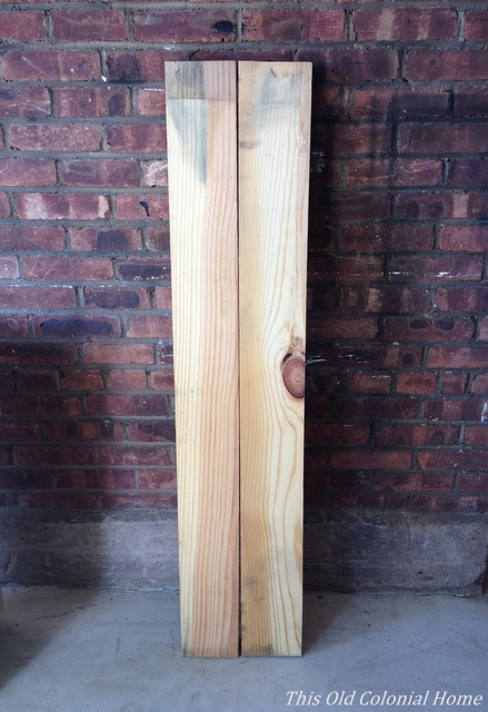 We then screwed the backs of the boards to another scrap piece at the top and bottom.
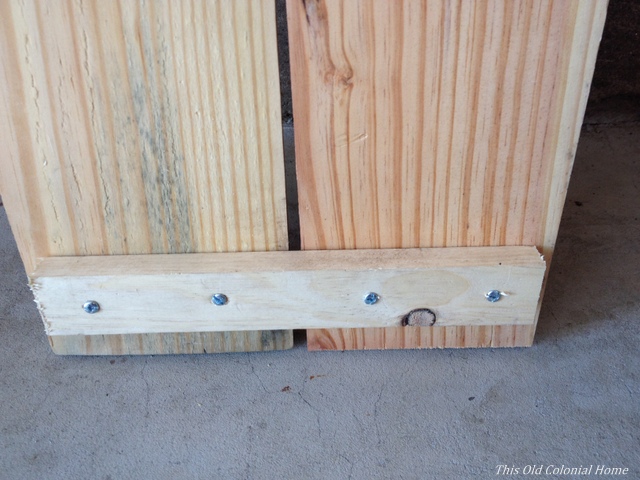
 Before staining the wood, I did a little sanding to get some markings off. Then I decided to try Minwax Weathered Oak for, you guessed it, that weathered look.
 The first coat came out pretty light even after leaving it on for 15 minutes. I did a second coat, again leaving it on for 15 minutes, which helped. A third coat probably would’ve been just the ticket. Oh well.
  As for the letters, I decided to save some cash by printing my own. In Microsoft Word I picked the font Franklin Gothic at size 630. You’ll want to measure how big to make your letters. My boards were about 52″ long and I had 8 letters, so I figured around 6″ per letter, allowing room for spacing. (Yay guesstimated math!) I printed each letter on cardstock paper. To save on ink, just print the outline of the letters.
 After I cut out each letter, I used two-sided tape to attach them to the boards.
 This turned out to not be the best idea because the tape stuck to the wood more than the paper. After I traced the letters there was a lot of prying up with my fingernails.
For painting the letters I used Pure Pumpkin craft paint (that’s the actual color name) from Michael’s and used a small art brush to apply it. I probably could’ve used a slightly bigger brush, but I worked with what I had. And then I realized — while trying to stay in the lines and getting visible brush strokes — I probably should’ve cut the letters as a stencil instead. (Shoulda, coulda, woulda. Learning as I go!)
 Once the letters were dry, I did a little light hand sanding using 220-grit sandpaper to dull the orange.
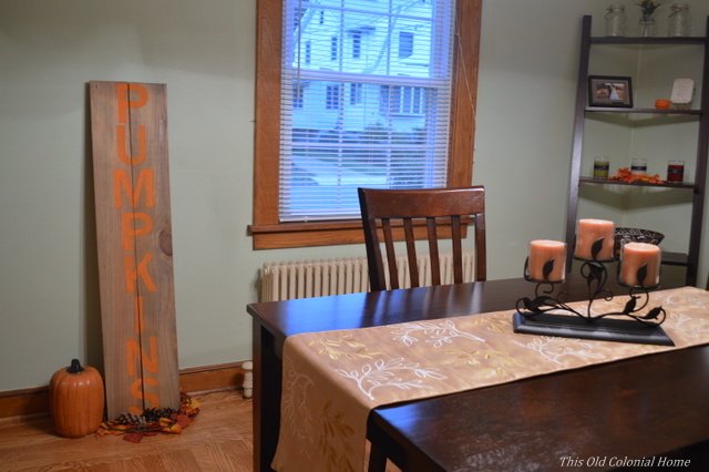
And here it is on display in our dining room (and safe from pumpkin-buying passersby).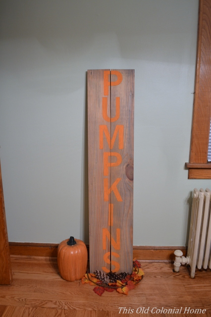

 So all in all this project didn’t go quite as smoothly as I figured (does it ever?!) But I’m pretty happy with the end result and will now know better for the next time. Because let’s face it, there will be a next time!
Linking up with Bless’er House

October 3, 2014 at 8:10 am
very cute!!
LikeLike
October 6, 2014 at 7:04 pm
Thank you!
LikeLike
May 14, 2024 at 5:05 am
This was aa lovely blog post
LikeLike